


 In the fast-paced trade show environment, you only have 3 seconds to grab the attention of attendees passing by your booth. If your graphics use low-resolution images and large blocks of text, then your exhibit will fade into the background along with your company’s brand. Through the application of basic principles in large format graphic design, you can drastically improve the return on your investment at your next event.
First of all, it is important to realize that you are designing graphics for a trade show exhibit, not a museum exhibit. Museum exhibits are usually erected for information purposes, while trade show displays are usually erected for branding purposes. Attendees will not stop to read anything that is written on the back wall of your booth except for your logo and a statement of what you do as a company, so why fill up your valuable graphic area with bullet points and blocks of text? According to Susan Friedmann, a well-designed exhibit should contain 7 words or less. With your logo and a focused positioning statement that expresses what your company offers, attendees will have all the information they need to decide whether or not they want to visit your booth.
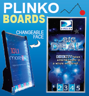
 Secondly, your trade show display will make a more lasting impression upon attendees if you use high-resolution, bold images to relay your message. If you want to let potential clients know that your orange juice is fresher than your competitor’s orange juice, a high-resolution image of a fresh glass of orange juice would send that message more effectively than a large block of text describing how fresh your orange juice is. When in doubt, you should always use images to represent key ideas and concepts as opposed to text, as this will generate further interest in your exhibit and increase the return on your investment.
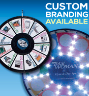
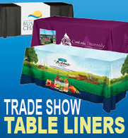
Thirdly, brand consistency is very important when designing your trade show graphics. The overall feel of your exhibit should match the trade show literature you’ve designed as well as the branding on your promotional products. The goal of any successful trade show marketing campaign is to leave visitors and attendees with a lasting impression of your company image, and it is important to make sure that you have a consistent image across the spectrum of your marketing material. If your potential clients return to their offices after the conference with a vivid picture of your branding images and a good idea of what your company offers, then you have accomplished your mission.
Finally, it is important to pay careful attention to color choices when designing your graphics. Because it is important to be consistent, most companies will be limited by the colors already in use on their website and in their print marketing material, but even within a limited color selection there is a wide range of effects that can be created. Bold colors work well if you want to create a high-energy environment, and soft tones work well if you want to create a relaxed, inviting atmosphere. Unusual colors such as pink and yellow work well to create visual interest, but may have negative connotations that detract from the overall scheme of your marketing program. Before choosing colors for your company’s trade show marketing program, you should carefully evaluate your marketing goals so that your exhibit functions well within its context.
About the Author:
Andy Keeler is the President of MODdisplays, a company that specializes in the sale of portable trade show displays and exhibiting accessories. MODdisplays proudly features the Exhibit One display, the best selling hybrid exhibit on the market.