


This lesson is going to be a bit different from my traditional lessons; for this lesson I will be showing pictures of three booths that just didn’t quite “make the grade” and describe the A, B, C’s of how those companies could have improved the information displayed to better reach their target audience. I’ve edited out the actual company names, and should you recognize the booth, please realize that those pictures are simply examples of unfortunately rather common mistakes to be found on every show floor.
Your homework will be to evaluate your current display and see where you can apply some of the “lessons learned” from this article.
Why this Booth “Doesn’t Make the Grade”
 When I saw this exhibitor I actually had to stop to exclaim “WOW, you have A LOT of information going on there!” Keep in mind; this picture only shows a small portion of what was crammed into the 10×10 booth! I explained to this exhibitor that it was hard to understand what he was trying to accomplish because this display was “too busy” and a lot of attendees would be inclined to walk right past this booth. He laughed and had to agree. He then asked for some tips to improve his exhibit the next time around. I told him many exhibitors like him are very excited about the product they offer and it is common to want to share as much as possible. Many of the items plastered all over this booth really belong into marketing material that people take home with them AFTER being attracted to the booth.
The A, B, C’s of How to Make This Booth More Effective:
A.) This booth has the advantage of the backdrop being red, so immediately attendee’s eyes will be drawn towards this booth, now we just need to stop from making them dizzy! To do this, the text should read something like this:
Top of Booth:
– “Company Name” is the Perfect Home Based Business
Or
-“Type of Business” is the Perfect Home Based Business
The right choice here depends on whether you think the Company Name has any name recognition or if the type of business generates more recognition “Below the “Headline”:
Have 3 Bullet points about the product/program benefits and a graphic. THAT’S ALL, LESS IS MORE, trust me on this one. I know this is counter intuitive for many. But we haven’t been out of the caves long enough for our brains to do well with lots of information. Our brains filter information for relevance and preference. Viewers will only take 2-3 things away from the display; make sure that whatever this is counts! (Keep in mind to have all the text up high in the line of sight – not where people will be standing in front of it!
B.)Keep the signs that say “Do you want to work from home?” But all of the other pictures and text have “got to go”! Put the text into nice little hand outs.
C.)It’s a little hard to see in this picture, but the table should be moved to the side of the booth so it runs along the side pipe and drape so they can draw attendees into the booth for conversations. It’s a tradeshow booth, not a castle to be defended.
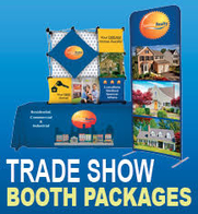
Why this Booth “Doesn’t Make the Grade”
 This booth is not very memorable, but it is aesthetically pleasing to the eye and would make a great brochure. However this booth was not designed to be folded up and put in the bags of passing tradeshow attendees! The reason this booth makes my list is that the text is way too small to read. Trade Show displays need to be designed like billboards you see on the side of the road; flashy and memorable, with very limited amounts of targeted text. Additionally, when the booth staffers are in the booth anyone coming by with binoculars who could actually read that text would be blocked from doing so by the exhibitors!
TIP: Type should be created at one inch in height for every three feet the attendee steps backward
The A, B, C’s of How to Make This Booth More Effective:
A.) Keep the Following Items on the Display:
- The top of the booth where the logo, graphics and images area could stay just as is
- The text next to the logo is fine; it is targeted and explains exactly what the company does
- The logos on the sides of the booth are fine to stay, although they “don’t do much” to help the display
Remove the following items:
- Everything below the logo, graphics and images should be deleted, leaving the area white. (or other suggestion – see below)
B.)The text with the benefit statement bullet points (currently on the right hand side) should be trimmed down and put onto 2 smaller banners that are placed on the sides of the pipe and drape
C.) In the area that would be left white, if done as suggested, a design type of image that complements the current graphics and images could be added, or the space could even be left white.
Another way to grab attention to this booth would be to change the color scheme around and take the lime green color used in the graphic above the logo and make that the primary color of the booth, that’s a surefire way to grab attention!
You can probably tell some of the reasons why this Booth “Doesn’t Make the Grade”
 This booth has way too much going on and looks more like a High School Science Project! Now the tradeshow this booth was at was actually science related, but I am sure the “science fair look” was not what this exhibitor was going for; though I wouldn’t be surprised if some of their tradeshow experience was gained right there. The kid with the beanie is pretty cute though; but hopefully not part of the display!
This booth needs to be cleaned up and de-cluttered; there is a lot of information all over the place and stuff lying all around the booth.
The A, B, C’s of How to Make This Booth More Effective:
A.) At the top of the booth
- Keep the heading where the logo is In the 2 Center Panels
- Find a creative graphic that has a scientific feel to it that matches the company’s desired image and colors.
TIP: Very creative, good looking vector based (so you can enlarge them to any size you need) graphics can be purchased from sites like istockphoto.com for about $10.
Side Panel (Right side)
- Replace the pictures of the products with brief, concise benefit statements about the products in large text. Not features, but the benefits the end user experiences from using the product. Remember the first booth in this article. LESS IS MORE!
Bottom Panel (Right Side)
- Remove completely. Nobody can and would read it!
B.) Move the round table over to the side of the booth along the pipe and drape and set up the chairs in an inviting manner that make attendees want to stop, come in and sit down and talk about the products. And that is of course assuming you have products that justify such a lengthy stay. Get rid of the table and chairs altogether if there is no benefit to having people stay for more than a few minutes.
C.)Clear the clutter!
- Empty the garbage can
- Clear the bottles from the counter
- Put the apples away!
- Clear off the table except for a brochure and business cards
Now you have seen the examples and read the A,B, C’s for how these companies could easily improve their results. But since I still have your attention and there would be white space left if I didn’t write more; I’ll stay after class with you a bit to share a few more tips for your exhibits. But you better do your homework! I want to see all of you in A+ worthy booths from now on!
 After all these A.B.C.s I am having a quick A.D.D. moment and need to jump to another topic quickly, the topic of qualified leads. Your booth should be helping to attract qualified attendees to visit your booth; which is complimented by marketing and promotional activities you implement as well. But, if you see someone wearing and carrying something from everyone’s booth, rest assured that they are NOT a qualified lead; they are a “Trick-or-Treater!
These type of people will stop by, make small talk and act interested in your booth and products, then grab your promotional item and run before you know what happened! Below is a perfect example I just had to share with you!
We will cover how to determine the most appropriate promotional items, how to qualify attendees and how to get the most impact from them in future lessons. For now, use the following tips to keep your items safe and secure by keeping your promotional items towards the back of the booth, including collateral. Be careful if you see someone like this strolling down the aisle! She was a very sweet lady, but trust me, she’ll do a hit-n-run and grab your stash of give aways before you know what hit you!
Whewww…Now I got that out of my system and can return to the subject at hand!
What does good signage consist of?
For starters, you will need to properly target your copy; be sure to pin point the most important thing attendees want to know!
- “What’s in it for me?!” Train yourself to focus on pointing out the “Benefits” of the product instead of the “Features”. Hoping your products have one, think about their positioning statement. Who are they for? What do they do?
Keep it simple. All You Need on Your Signage Is: - Company Name or Logo
- Tagline that describes what products or services your company provides
- One Large Graphic
- One to Three Key Benefits
- Use “Compelling Copy” with words such as: Discover, How, Easy, Eliminate, Fast, Free, Guaranteed, Increase, Learn How, New, Proven, Reduce, Save, Tips, Techniques, Target Audience, You, Your
Thank you for being so eager and wanting to continue learning, but I am running out of space and its time to end. Now do your homework and apply the A,B,C’s of Successful Exhibiting! Check in next month to see the type of booths that you will want to emulate. I will share many pictures and describe why the booths got an A+ grade. See you next month!
Jonathan Edelman provides helpful advice about trade show strategies. With years of experience in the trenches, he is an expert on booth displays, follow up techniques, and using trade show marketing strategies to boost revenue.